Website navigation best practices ensure visitors find what they need quickly and easily. Poor navigation frustrates visitors and drives them to competitors instead. Furthermore, confusing navigation increases bounce rates and hurts your search rankings directly.
Your navigation is like a roadmap guiding visitors through your website. Without clear directions, visitors get lost and give up frustrated. Consequently, even excellent content becomes worthless if nobody can find it.
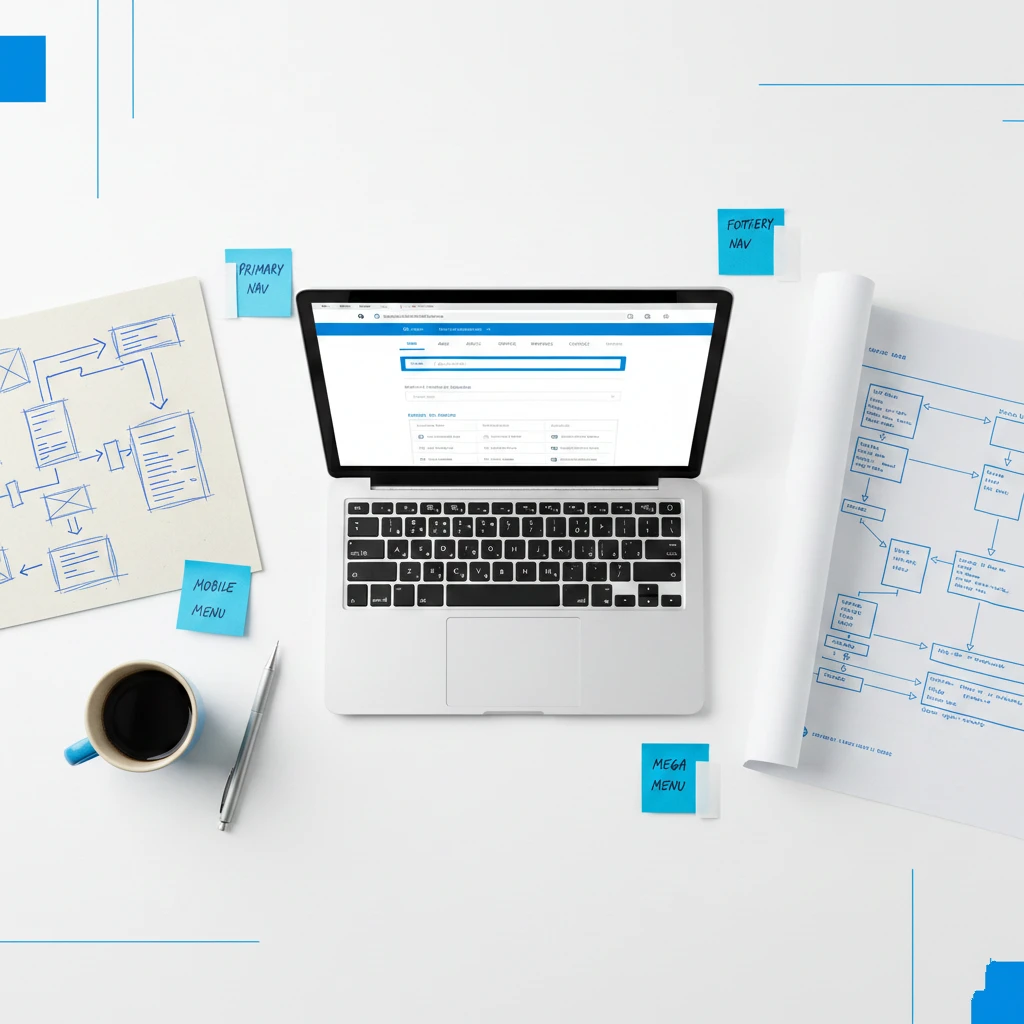
This guide covers essential website navigation best practices for small business websites. You’ll learn how to create intuitive navigation that improves user experience and conversions.
Why Website Navigation Matters
Understanding navigation importance motivates investment in getting it right. The impact extends across multiple business metrics.
Navigation Affects User Experience
Visitors judge your website within seconds of arriving initially. Confusing navigation creates immediate negative impressions unfortunately. Conversely, clear navigation makes visitors feel confident and comfortable.
According to Nielsen Norman Group research, navigation is the primary way users explore websites. Poor navigation creates cognitive strain that drives visitors away.
Navigation Impacts Conversions
Visitors who can’t find what they need won’t convert obviously. They’ll leave without contacting you, buying, or taking action. Therefore, navigation directly affects your business results.
Every click required to reach important pages loses potential customers. Streamlined navigation keeps more visitors engaged throughout their journey.
Navigation Influences SEO
Search engines use navigation to understand your website structure clearly. Logical navigation helps search engines crawl and index pages effectively. Furthermore, good navigation distributes link equity throughout your site.
Google’s guidelines emphasize the importance of crawlable navigation links. Poor navigation can hide pages from search engines entirely.
Navigation Builds Trust
Professional navigation signals a professional business immediately. Visitors trust websites that feel organized and well-maintained. Conversely, confusing navigation suggests incompetence or neglect.
First impressions form quickly based on navigation quality. Trust begins with confident, easy exploration.
Navigation Reduces Support Burden
When visitors find information easily, they don’t need to contact you unnecessarily. Self-service reduces support requests and saves time significantly. Therefore, good navigation improves operational efficiency.
FAQs and help content are only useful when people can find them. Navigation makes self-service actually possible.
Core Website Navigation Best Practices
Follow these fundamental principles for effective navigation consistently.
Keep It Simple
Complex navigation overwhelms and confuses visitors unnecessarily. Limit main navigation to seven items maximum ideally. Fewer choices make decisions easier for everyone.
Hick’s Law explains that more options increase decision time exponentially. Simplicity improves user experience dramatically.
Remove navigation items that don’t serve clear purposes directly. Every item should earn its place through usefulness.
Use Clear, Descriptive Labels
Navigation labels should clearly describe destination content accurately. “Services” is clearer than “What We Do” typically. Furthermore, avoid clever or creative labels that confuse visitors.
Visitors shouldn’t guess what clicking a label will reveal. Clarity beats creativity for navigation labels always.
Test labels with real users to ensure understanding universally. What seems obvious to you might confuse others.
Maintain Consistency Throughout
Navigation should appear identically on every page consistently. Changing navigation location or style disorients visitors. Therefore, maintain consistent placement and design throughout.
Visitors learn navigation patterns quickly during initial exploration. Breaking patterns creates confusion and frustration.
Prioritize by Importance
Order navigation items by importance and visitor need specifically. Most important items should appear first or most prominently. Consequently, visitors find primary content easily.
Analyze which pages visitors need most frequently. Use data to inform navigation prioritization decisions.
Make Current Location Clear
Visitors should always know where they are within your site. Highlight the current page in navigation visually clearly. Furthermore, breadcrumbs show the path to current location.
Location awareness prevents disorientation during exploration. Visitors feel confident knowing their position.
Types of Website Navigation
Different navigation types serve different purposes effectively. Most websites need multiple navigation elements.
Primary Navigation
Primary navigation contains your most important pages prominently. It typically appears in the header across all pages. Furthermore, it provides access to main sections of your site.
Limit primary navigation to essential destinations only strictly. Supporting pages belong in secondary navigation instead.
Secondary Navigation
Secondary navigation provides access to less critical pages appropriately. Footer navigation often serves this purpose effectively. It includes pages like Privacy Policy, Terms, and Sitemap.
Secondary navigation reduces primary navigation clutter beneficially. It accommodates necessary pages without overwhelming visitors.
Utility Navigation
Utility navigation includes functional items like search, login, and contact. These appear separately from main content navigation typically. Furthermore, they’re often positioned in header corners.
Keep utility navigation items minimal and clearly functional. They serve specific tasks rather than content exploration.
Breadcrumb Navigation
Breadcrumbs show the hierarchical path to the current page clearly. They help visitors understand site structure and location. Furthermore, they provide quick access to parent categories.
Google recommends breadcrumbs for improved search appearance. They benefit both users and SEO simultaneously.
Footer Navigation
Footer navigation provides comprehensive links to important pages. Many visitors scroll to footers expecting navigation options. Furthermore, footers accommodate more links than headers.
Include contact information, social links, and legal pages consistently. Footers serve visitors who’ve explored without finding what they need.
Mobile Navigation
Mobile navigation requires special consideration due to limited space. Hamburger menus hide navigation behind an icon efficiently. However, hidden navigation reduces discoverability unfortunately.
Balance space constraints with navigation accessibility carefully. Critical items might deserve persistent visibility.
Website Navigation Best Practices for Structure
How you organize navigation structure impacts usability significantly. Follow these structural guidelines.
Create Logical Groupings
Group related pages together under clear parent categories logically. Services should contain all service pages obviously. Furthermore, groupings should match visitor mental models.
Illogical groupings force visitors to search multiple sections frustratingly. Think about how visitors would expect content organized.
Limit Dropdown Depth
Deep dropdown menus with multiple levels frustrate users considerably. Limit dropdowns to two levels maximum ideally. Deeper structures indicate content organization problems.
If you need deep navigation, reconsider your content structure entirely. Flatter hierarchies improve usability significantly.
Use Mega Menus Carefully
Mega menus display multiple columns of links on hover simultaneously. They work well for large sites with extensive content. However, they can overwhelm visitors on smaller sites.
Only use mega menus when content volume justifies them clearly. Simpler navigation usually performs better.
Ensure Click Paths Are Short
Important pages should be reachable within three clicks maximum. More clicks lose impatient visitors progressively. Therefore, prioritize important content in navigation hierarchy.
Audit click paths to key conversion pages specifically. Reduce clicks wherever possible.
Balance Breadth and Depth
Wide, shallow navigation shows many top-level options prominently. Deep, narrow navigation hides options under categories. Neither extreme works perfectly alone.
Find balance appropriate for your content volume and visitor needs. Test different structures to find optimal approach.
Mobile Navigation Best Practices
Mobile navigation presents unique challenges requiring specific solutions. Apply these mobile-specific practices.
Prioritize Mobile Navigation
Over 60% of traffic comes from mobile devices currently. Therefore, mobile navigation deserves primary consideration always. Desktop navigation should adapt from mobile, not vice versa.
Test navigation on actual mobile devices regularly. Emulators miss real-world touch interaction issues.
Make Touch Targets Large
Fingers are less precise than mouse cursors obviously. Touch targets need minimum 44×44 pixels for accurate tapping. Furthermore, spacing between targets prevents accidental clicks.
Apple’s Human Interface Guidelines specify touch target requirements clearly. Follow these standards for mobile success.
Consider Bottom Navigation
Thumb-friendly navigation places key items at screen bottom conveniently. This pattern has become increasingly popular for good reason. Visitors can navigate one-handed easily.
Reserve bottom navigation for primary actions only strictly. Too many items defeat the purpose.
Make Hamburger Menus Discoverable
Hamburger menus hide navigation behind three horizontal lines iconically. While space-efficient, they reduce discoverability significantly. Therefore, ensure the icon is recognizable and prominent.
Consider adding “Menu” label beside the hamburger icon helpfully. Labels improve recognition for less tech-savvy visitors.
Test Navigation on Multiple Devices
Different devices render navigation differently sometimes. Test on various phones and tablets regularly. Furthermore, test both iOS and Android devices.
Real device testing catches issues emulators miss entirely. Invest time in thorough mobile testing.
Website Navigation Best Practices for Design
Visual design impacts navigation usability significantly. Apply these design principles.
Ensure Adequate Contrast
Navigation links must be clearly visible against backgrounds obviously. Low contrast makes navigation difficult to read unfortunately. Therefore, ensure sufficient contrast ratios.
WebAIM’s Contrast Checker verifies your contrast meets accessibility standards. Accessibility benefits everyone, not just disabled users.
Use Visual Hierarchy
Important navigation items should appear more prominent visually. Size, color, and position create visual hierarchy effectively. Consequently, visitors notice priority items first.
De-emphasize secondary items without hiding them completely. Hierarchy guides attention appropriately.
Include Hover States
Hover states indicate which items are clickable clearly. They provide feedback confirming visitor actions immediately. Furthermore, they improve overall navigation usability.
Ensure hover states are visually distinct but not jarring. Subtle changes work better than dramatic ones.
Make Active States Obvious
The current page should be clearly indicated in navigation. Visitors need to know where they are at all times. Active states provide this essential orientation.
Use color, bold text, or underlines to indicate active pages. Ensure active states are distinct from hover states.
Don’t Rely on Color Alone
Color-blind visitors may not distinguish color-based navigation cues. Combine color with other indicators like underlines or icons. This practice improves accessibility for everyone.
Test navigation with color blindness simulators available online. Ensure navigation remains usable without color perception.
Common Navigation Mistakes to Avoid
Many websites make these navigation errors repeatedly. Learn from their mistakes.
Too Many Options
Overwhelming visitors with excessive choices paralyzes decision-making. They can’t decide where to go and leave instead. Therefore, ruthlessly limit navigation options.
If everything is important, nothing is important practically. Prioritize and simplify aggressively.
Unclear Labels
Creative or vague labels confuse visitors unnecessarily. “Solutions” could mean almost anything realistically. Furthermore, industry jargon excludes visitors unfamiliar with terminology.
Use plain language that everyone understands immediately. Test labels with people outside your industry.
Inconsistent Placement
Moving navigation between pages disorients visitors significantly. They expect consistency based on initial learning. Therefore, maintain identical placement throughout.
Even small position changes create momentary confusion. Consistency reduces cognitive load.
Hidden Important Pages
Burying important pages deep in navigation structures frustrates visitors. Key content should be easily accessible always. Therefore, audit navigation paths to important pages.
If visitors frequently ask for pages, those pages need better navigation placement. Support requests indicate navigation problems.
Broken Links
Broken navigation links immediately damage credibility and trust. They signal neglect and poor maintenance clearly. Therefore, regularly test all navigation links.
Automated tools can check for broken links periodically. Broken Link Checker offers free testing.
Dropdown-Only Access
Some pages only accessible through dropdown menus create problems. If parent items don’t link anywhere, visitors miss content. Furthermore, search engines may not find dropdown-only pages.
Ensure all pages are accessible through multiple paths ideally. Don’t trap content behind single navigation methods.
Navigation for Different Page Types
Different pages may need different navigation approaches appropriately.
Homepage Navigation
Homepage navigation introduces visitors to your entire site structure. It should provide clear paths to all major sections. Furthermore, it sets expectations for navigation throughout.
Include prominent calls to action alongside standard navigation. Guide visitors toward conversion paths specifically.
Service and Product Pages
These pages benefit from related item navigation prominently. “Related Services” or “You May Also Like” sections help exploration. Furthermore, clear paths to contact or purchase matter.
Don’t trap visitors on single pages without onward navigation options. Facilitate continued exploration.
Blog Post Navigation
Blog posts need category navigation, related posts, and search functionality. Visitors often want more content on similar topics specifically. Furthermore, clear paths back to main blog help orientation.
Include author pages and popular post links when appropriate. Help visitors discover more valuable content.
Contact Pages
Contact page navigation should include multiple contact options clearly. Display phone, email, address, and form access prominently. Furthermore, link to FAQ pages for self-service options.
Don’t hide contact information behind unnecessary navigation steps. Make reaching you as easy as possible.
Landing Pages
Landing pages often minimize navigation intentionally strategically. Fewer distractions keep visitors focused on conversion specifically. However, some navigation provides reassurance and options.
Balance conversion focus with visitor needs appropriately. Testing reveals optimal navigation levels.
Testing and Improving Navigation
Continuous improvement keeps navigation effective over time. Apply these testing strategies.
Conduct User Testing
Watch real visitors navigate your website for invaluable insights. User testing reveals problems you’d never notice yourself. Furthermore, it validates or challenges your assumptions.
Ask users to complete specific tasks while thinking aloud. Their commentary reveals confusion points directly.
Analyze Navigation Analytics
Google Analytics shows how visitors navigate through your site. Identify where visitors drop off or get confused specifically. Furthermore, track which navigation items get clicked most.
Data reveals actual behavior rather than intended behavior. Use data to inform navigation decisions.
A/B Test Navigation Changes
Before committing to changes, test alternatives with real visitors. A/B testing reveals which navigation performs better objectively. Furthermore, testing prevents harmful changes.
Test one change at a time for clear conclusions always. Multiple simultaneous changes confuse results.
Review Search Queries
Site search queries reveal what visitors can’t find through navigation. Frequently searched terms might need navigation placement. Furthermore, search data indicates navigation gaps.
If visitors search for “contact” frequently, your contact navigation needs improvement. Search behavior indicates navigation failures.
Monitor Bounce Rates
High bounce rates on specific pages may indicate navigation problems. Visitors who can’t continue their journey leave entirely. Therefore, investigate pages with unusual bounce rates.
Compare bounce rates before and after navigation changes specifically. Improvements validate your changes.
The Bottom Line
Website navigation best practices ensure visitors find what they need quickly. Clear, intuitive navigation improves user experience, conversions, and SEO simultaneously. Furthermore, professional navigation builds trust and credibility.
Start by auditing your current navigation objectively and thoroughly. Identify areas of confusion, excess complexity, or poor labeling specifically. Then apply the principles from this guide systematically.
Remember that navigation affects every visitor’s experience profoundly. Even small improvements compound into significant business impact. Therefore, navigation optimization deserves ongoing attention.
Your competitors may have superior navigation already established. Therefore, improving yours should become an immediate priority for your business. Start implementing these website navigation best practices today.
Need help improving your website navigation? Get a free quote or contact us to discuss your website needs.