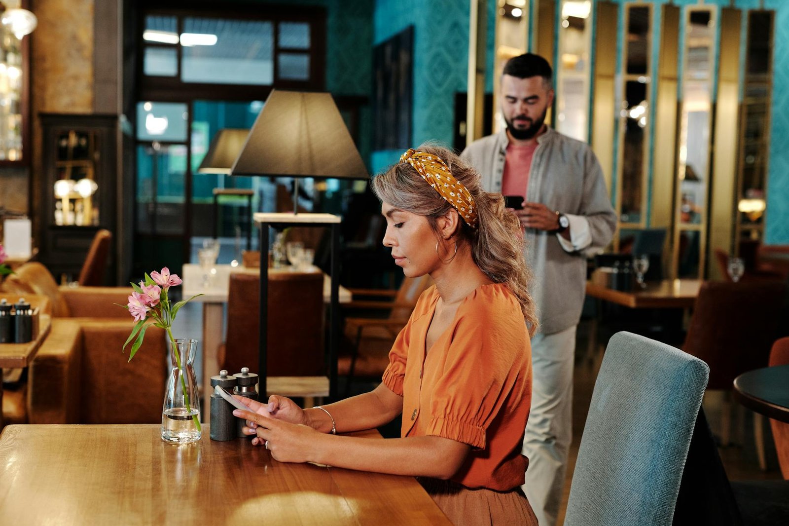
Roughly three-quarters of Boston diners pull up a restaurant’s website before they decide where to eat, and most of them are doing it one-handed on a phone while standing on a sidewalk in the North End, Back Bay, or outside a packed spot in Cambridge. The decision window is short. If your homepage stalls on a slow connection, buries the menu behind a PDF, or asks for three taps before someone can see your hours, the group you almost won is already walking toward the place two doors down.
That shift from desktop research to in-the-moment mobile decision-making has quietly rewritten the rules for restaurant websites. A site that looked fine in 2022 can quietly bleed covers in 2026, not because it’s broken, but because diner expectations have moved faster than most operators have updated their sites. Speed, clarity, and frictionless ordering are no longer competitive advantages; they are the baseline cost of being considered.
This article walks through what Boston diners actually expect from a mobile restaurant experience this year: why mobile-first is now the default decision environment, what needs to be visible in the first five seconds, how to handle online ordering and reservations, the role of reviews and trust signals in the mobile decision loop, how loyalty and SMS turn one visit into repeat revenue, and which AI and performance upgrades are worth adopting in 2026.
Why Mobile-First Is Now the Default Decision Environment
For a Boston restaurant in 2026, the question is no longer whether mobile matters. It is whether the mobile experience is good enough to win the diner who is already holding a phone, already hungry, and already comparing you to three other spots within a six-block radius. Mobile has stopped being a traffic channel and has become the default decision environment where the choice of where to eat actually happens. That distinction is small in wording and enormous in operational consequence.
The data backs up what most operators already feel at the host stand. A 2025 MGH survey found that more than 77 percent of diners check a restaurant’s website before deciding where to eat, and more than half abandon restaurants whose sites lack updated menus or easy ordering. A separate finding cited in industry coverage shows that 68 percent of diners are discouraged from visiting a restaurant because of a poor website. Those numbers are not abstract. They translate directly into empty two-tops on a Tuesday night.
What 68 Percent Actually Costs a Small Boston Operator
Run the math against a realistic small Boston operator doing, say, 80 covers on a weekday. If a meaningful share of the diners who considered you bounced because the menu would not load on an iPhone, or because the reservation widget timed out, the lost revenue is not theoretical. It is the difference between a profitable shift and a flat one. The diner does not email you to complain. They simply tap back to the search results and choose the place next door whose site loaded cleanly.
A Shift From “Mobile-Friendly” to Mobile-Default
The older framing was that a restaurant site needed to be mobile-friendly, meaning it had to also work on phones. The 2026 framing is inverted. Desktop is the secondary surface. Furthermore, the website is increasingly expected to carry not just information but the full decision workflow: menu, ordering, reservations, and the trust signals that close the choice.
Pros of treating mobile as the default surface:
– Matches where the decision is actually being made
– Reduces lost covers from diners who bounce on slow or broken pages
– Aligns naturally with online ordering, delivery integrations, and event promotion that modern restaurant site builders now support
Cons and tradeoffs:
– Forces real investment in performance, not just visual polish
– Desktop-first design habits and legacy templates have to be retired
– Owners must judge mobile QA against their own phone, not the designer’s laptop
The rest of this article moves from this baseline into the specifics: what diners need to see in the first five seconds, how ordering and reservations should behave on a phone, where reviews and trust signals fit in the mobile decision loop, and which AI and performance upgrades are worth the spend in 2026.
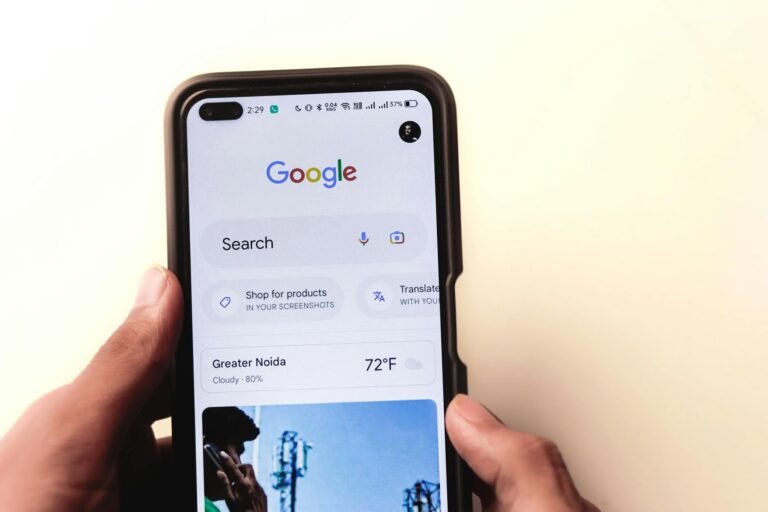
What Boston Diners Expect to See in the First Five Seconds
A diner standing on Newbury Street with cold hands and a hungry friend is not going to scroll. They tap your restaurant, glance at the screen, and decide. The first five seconds on a phone determine whether they walk to your door or to the place two storefronts down. That window is short, and it is unforgiving.
Industry research backs up how unforgiving. According to a 2025 MGH survey cited in DoorDash’s 2026 guide to restaurant websites, over 77 percent of diners check a restaurant’s website before deciding where to eat, and more than half abandon restaurants whose sites lack updated menus or easy ordering. Translation: if your mobile home screen does not surface the right things immediately, you are losing more than half of the people who bothered to look you up.
The Non-Negotiable Four
Four elements need to be visible, legible, and accurate inside that opening glance:
- An up-to-date menu. Not a PDF that pinches to zoom. Live text, current prices, current dishes.
- Today’s hours. Not “Mon–Fri” buried in a footer. The current day, ideally with an open/closed indicator.
- Location. A clear address with a one-tap link to maps.
- A visible path to act. Either “Book a Table” or “Order Online,” depending on what your restaurant actually does, placed where a thumb can reach it.
Furthermore, that action button should not hesitate. DoorDash’s guidance is direct: the website should reflect your unique personality and style, enticing visitors to click “Book a Table” or “Order Online” without hesitation. Personality and the call-to-action are not in tension. A sandwich shop and a tasting-menu restaurant can both have strong character on the home screen and still put the primary action one tap away.
Personality vs. Friction: A Quick Comparison
When small operators redesign, they often debate atmosphere-first versus action-first layouts. Both have trade-offs.
Atmosphere-first (big hero image, slow reveal of buttons)
– Pros: Strong brand impression, good for fine dining and destination spots.
– Cons: Pushes the order or reserve button below the fold, costs you the impulse diner.
Action-first (menu, hours, and button immediately visible)
– Pros: Captures decisions in the five-second window, fewer abandoned sessions.
– Cons: Can feel utilitarian if the photography and type are not doing the brand work.
The practical answer for most Boston small restaurants is action-first with personality baked into typography, color, and a single strong image, rather than a full-screen video that the diner has to wait through.
What This Means for Your Business
If you are the owner-operator updating your own site between lunch and dinner service, audit it from your own phone tonight. Open it on cellular, not Wi-Fi. Time how long until you can see today’s hours and tap the order or reservation button. If it takes more than five seconds, or requires a scroll, you are watching revenue walk past your door. The fix is rarely a full redesign. Moreover, it is usually a reshuffle: promote the menu link, pin hours to the top, and make the primary action button impossible to miss.
Online Ordering, Reservations, and Delivery Integrations
The phone-friendly homepage gets the diner interested. The ordering flow is what turns that interest into a paid ticket. In 2026, advanced restaurant website builders are expected to support online ordering workflows, delivery integrations, event promotion, and mobile performance optimization as standard features rather than premium add-ons. For a Boston small restaurant, that shift changes the strategic question. The question is no longer “should we be online?” It is “whose checkout button are we sending our regulars to?”
Own the Flow, or Rent It
There are essentially two ways to take an online order. You can route everything through third-party marketplaces like the major delivery apps, or you can build native ordering directly into your own website. Most small restaurants end up doing both, but the balance matters. Industry coverage frames the website itself as a primary driver of reservations, online orders, and customer trust, not just a digital menu. Therefore, treating your own site as the default order destination, with marketplaces as a discovery layer, protects your margins on repeat customers who already know your name.
Third-party marketplaces
- Pros: Built-in discovery, existing customer base, handles drivers and logistics, no upfront development cost.
- Cons: Per-order commissions, you do not own the customer relationship or data, your brand sits inside theirs, menu and pricing changes can be slow.
Native website ordering
- Pros: You keep more of every dollar, you own the guest data, the menu and hours stay in sync with the rest of the site, regulars learn one ordering flow.
- Cons: Requires setup and a payment processor, you (or your platform) handle support questions, delivery may still need a third-party or in-house driver arrangement.
The Builder Landscape
You do not have to assemble this from scratch. A category of restaurant-specific website builders now bundles menus, reservations, ordering, and mobile performance in one stack, and roundups such as the Top 5 Restaurant Website Builders in 2026 exist precisely to help operators compare them. Moreover, the same coverage notes that a restaurant’s site is its most powerful owned sales channel in 2026, the place loyal customers return to order and new guests discover the story.
What this means for your business is concrete: if a “Book a Table” or “Order Online” button on your own domain is buried two taps deep, you are paying commission on orders that should have been direct. Pick one builder shortlist this week, line it up against your current setup, and decide which orders you want flowing through your own checkout and which can stay on the marketplaces.
Reviews, Trust Signals, and the Mobile Decision Loop
A Boston diner standing on Newbury Street at 7:15 p.m. is not reading your “About” page. They are running a fast loop: tap the map pin, scan the star rating, glance at recent photos, jump to your site to confirm hours and menu, then decide. That loop happens on a phone screen in under a minute, and the research backs up how much weight reviews carry inside it. Industry data cited in coverage of restaurant website builders that actually drive orders notes that 94 percent of diners say online reviews influence where they eat. If your mobile site does not reinforce what those reviews promise, the loop breaks and the diner walks to the next door.
Surface reviews on the page, do not hide them
Reviews do their work when they appear at the moment of decision, not buried on a dedicated “Testimonials” page nobody taps. A short strip of recent quotes near the menu, a visible star count linked to your Google profile, and a few real customer photos near the reservation button all reinforce the credibility a review-driven visitor is already primed to find. Furthermore, the same builder roundup makes the point that in 2026 a restaurant site functions as a core business system for visibility, trust, and conversion, not a static brochure. Treat the review surface as part of that system.
Trust signals the diner is actually checking
The mobile decision loop runs on a small handful of facts. Get these wrong and no amount of social proof saves the visit:
Pros of tight, consistent trust signals:
– Hours that match what Google shows reduce “are you actually open?” calls
– An accurate, current menu cuts the bounce to a competitor’s site
– A tap-to-call number and a tap-to-map address remove friction at the exact moment of intent
– Visible reservation or order buttons confirm you want the business
Cons of letting them drift:
– Stale holiday hours on the site versus Google produce one-star reviews about wasted trips
– A menu missing the dish a diner saw on Instagram reads as careless
– Broken or slow-loading photos signal a closed or struggling restaurant, even when neither is true
Where to spend your one hour a week
If you only have sixty minutes, do not chase every review platform. Pick the two that matter most for your neighborhood, usually Google and one vertical platform your customers actually use, and keep those tight. Specifically: reply to the last week of reviews, confirm hours and menu match across your site and Google, and check that the “Reserve” or “Order” button on your homepage still works on a phone. That single weekly pass closes the loop between what a diner reads about you and what they experience when they land on your domain.
Loyalty, Email, and SMS: Turning One Visit Into Repeat Revenue
A mobile-first website is not just a tool for winning the first visit. In 2026, a restaurant’s website functions as a core business system that directly impacts visibility, trust, conversion, retention, and long-term profitability. The retention half of that equation is where most small Boston shops leave the easiest money on the table. You spent on ads, on photography, on a redesign — and the diner who actually showed up walks out without any way for you to reach them again. Loyalty, email, and SMS are how you close that gap, and your site is the on-ramp.
The Numbers Behind the Channels
The economics here are unusually clear for marketing. Email marketing in the restaurant industry returns roughly $42 for every dollar spent. SMS open rates in food service exceed 98 percent, compared to 20 to 30 percent for email. And restaurants using automated email campaigns generate 15 to 25 percent more repeat visits than those running outreach manually. Industry analysts have gone as far as to call automated loyalty marketing the biggest ROI most restaurants are leaving on the table, and the figures back that framing up.
Furthermore, neither channel works in isolation. SMS is the highest-attention channel you have, so it earns its keep on time-sensitive nudges: a slow Tuesday, a new seasonal menu, a reservation reminder. Email is the patient workhorse for longer messages, monthly specials, and birthday offers. Pairing them, rather than picking one, is what produces the lift the research describes.
Sign-Up Has to Be One Tap
None of this works if the on-ramp is broken. A mobile site that asks for first name, last name, email, phone, ZIP code, and a password before a diner sees a single perk is a list-building dead end on a phone keyboard. The sign-up needs to be one tap from the order confirmation, the reservation screen, or the homepage — and it should ask for the minimum to start, usually just an email or a phone number.
A realistic starter setup for a small Boston shop looks like this: a single sign-up field tied to the online order flow, a welcome email with a small first-visit incentive, a monthly newsletter, and one or two SMS sends per month reserved for genuinely time-sensitive offers. That is it. You do not need a tiered points engine in month one.
Pros and cons of leading with SMS versus email:
- SMS pros: ~98% open rates, immediate attention, ideal for last-minute fill (slow weeknights, weather-driven dips), short and frictionless to write.
- SMS cons: Easy to overuse and burn the list, carrier compliance requirements, per-message cost, no room for storytelling or photography.
- Email pros: ~$42 ROI per dollar spent, room for menu imagery and longer narrative, cheap at scale, supports automated birthday and win-back flows.
- Email cons: Lower open rates (20–30%), slower to act on, requires more design care to render well on mobile.
Therefore, the practical move for most operators is email as the default channel and SMS as the scalpel. Wire both up to the same one-tap sign-up on your mobile site, set the welcome and birthday automations once, and you have captured the retention engine the research keeps pointing at — without hiring an agency to run it.
AI, Performance, and What’s Actually Worth Adopting in 2026
The trend pieces this year are loud about two things: artificial intelligence inside restaurant operations, and websites that finally treat mobile performance as a first-class concern. Both matter. Neither is magic. The job for a small operator is to separate the parts that move revenue this quarter from the parts that are still a press release.
AI in restaurants is not new. Craver’s industry roundup points out that AI has been used in the restaurant industry for over a decade, albeit with more humble beginnings — think less “robots of the future” and more automated voice systems, and the current wave is framed largely as a response to persistent staff shortages. That framing matters. The question is not “should my restaurant have AI.” The question is which specific task is eating your team’s hours, and whether a tool can take that task off the floor.
Speed Is the Foundation Everything Else Sits On
Performance is the less glamorous half of this conversation, and the more important one. Modern restaurant website builders now bundle online ordering workflows, delivery integrations, event promotion, and performance optimization for mobile traffic as core features rather than upsells. That bundling exists because a slow menu page kills the order before any of the AI features get a chance to fire. Reservations, online orders, loyalty prompts, SMS opt-ins — all of it depends on the page rendering fast enough that a hungry person on the sidewalk does not bounce.
Furthermore, performance is the one area where the technical investment compounds. A faster site improves search visibility, ad efficiency, and conversion at the same time.
When Is This Overkill?
Here is the honest comparison for a single-location operator weighing the 2026 trend list.
Worth adopting now
– Mobile performance work on the menu, reservation, and order pages
– A single AI-assisted task that removes real labor (phone reservations, FAQ replies)
– Built-in analytics already shipped by your website platform
Probably overkill this year
– Custom-trained chatbots on top of a small menu
– Predictive inventory AI for a kitchen that already knows its prep
– Computer-vision drive-thru tooling for a dine-in concept
The pattern is consistent with the broader argument of this article. DoorDash’s guide frames the 2026 site as a primary driver of reservations, online orders, and customer trust, not a digital brochure. Therefore, every adoption decision should be tested against one question: does this make the website do more of the work a staff member used to do? If yes, it earns the line item. If it just adds a logo to the footer, skip it for another year.
Need Help with Your Restaurant’s Website?
If you’re a restaurant owner looking to reduce dependency on third-party delivery platforms or improve your online ordering experience, we’d be happy to discuss your specific needs. Monir Tech Solutions specializes in restaurant websites and POS integration for small businesses across the Boston area and beyond — including Clover POS, WooCommerce, and custom online ordering.
Reach out anytime at info@monirtechsolutions.com and we’ll respond within 24 hours.
The Bottom Line
For Boston diners in 2026, your restaurant website is the deciding factor before they ever walk in the door, and it has to do that work on a phone with one thumb and a spotty Back Bay WiFi connection. The shift this year is not subtle. Over 77 percent of diners check a restaurant’s website before deciding where to eat, and more than half abandon restaurants whose sites lack updated menus or easy ordering. That single statistic should reorder the priorities of any owner still treating the site as an afterthought between POS upgrades and the next round of vendor invoices.
What Actually Matters, In Order
The hierarchy is no longer up for debate. A fast mobile load comes first, because nothing else matters if the page never paints. A current menu comes second, because a six-month-old PDF tells a diner you do not care. Then comes a frictionless path to order or reserve, followed by visible reviews that confirm the choice, and finally a low-friction way to capture an email or SMS so the next visit is yours to earn, not Yelp’s to broker.
Pros of treating the site as your primary sales channel:
– Compounding returns. Every menu update, review, and reservation feeds the same asset you own.
– Lower third-party fees over time as direct ordering grows.
– Better data on who your regulars actually are.
Cons to be honest about:
– Real ongoing effort. Menus, photos, and integrations need a person who owns them.
– Upfront cost. A site built to convert in 2026 is not a $29-a-month template job.
– Tooling sprawl. Reservations, ordering, and email each have their own dashboards.
One Thing To Do This Week
Furthermore, none of this requires a redesign to start. The single most useful exercise an owner can do is also the cheapest. Walk to a coffee shop a few blocks from your restaurant, connect to their guest WiFi, and pull up your own site on your phone. Time how long it takes to find today’s menu and complete a test order or reservation. If it takes more than thirty seconds to reach the menu, or if a single tap on “Order Online” stalls, you have just identified the most expensive bug in your business. Write down what broke, send it to whoever maintains the site on Monday morning, and you have already moved further than most of your competitors will this quarter. The owned channel that DoorDash calls a primary driver of reservations, online orders, and customer trust only works if you are willing to be its first honest critic.